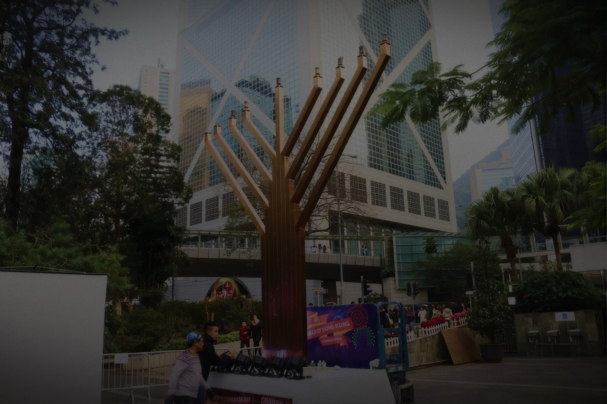
Chabad Hong Kong Visual Identity
Since 1986, Chabad Hong Kong has brought Jewish life closer to people from across the world. Through prayer and learning, youth programs, hospitality and care, it welcomes a community that spans nationalities, generations and levels of observance.
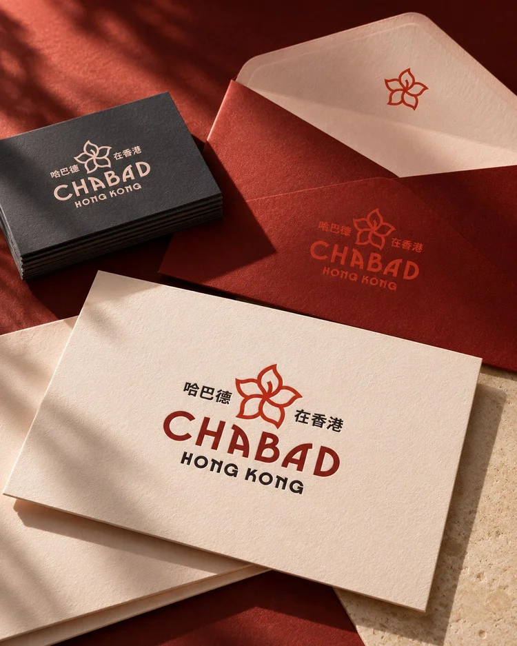
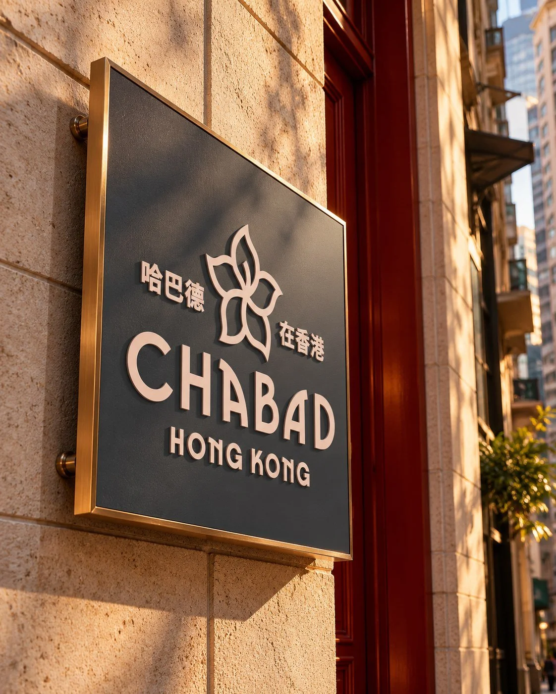
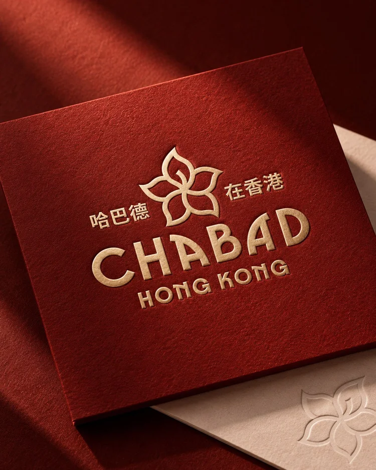
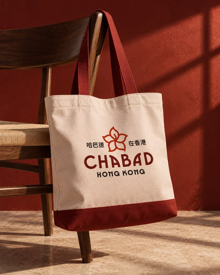
East meets West in a new look for a familiar Hong Kong institution. It’s modern without chasing trends, with a classic feel that suits a place that’s been here for 40 years, and will be here for many more.
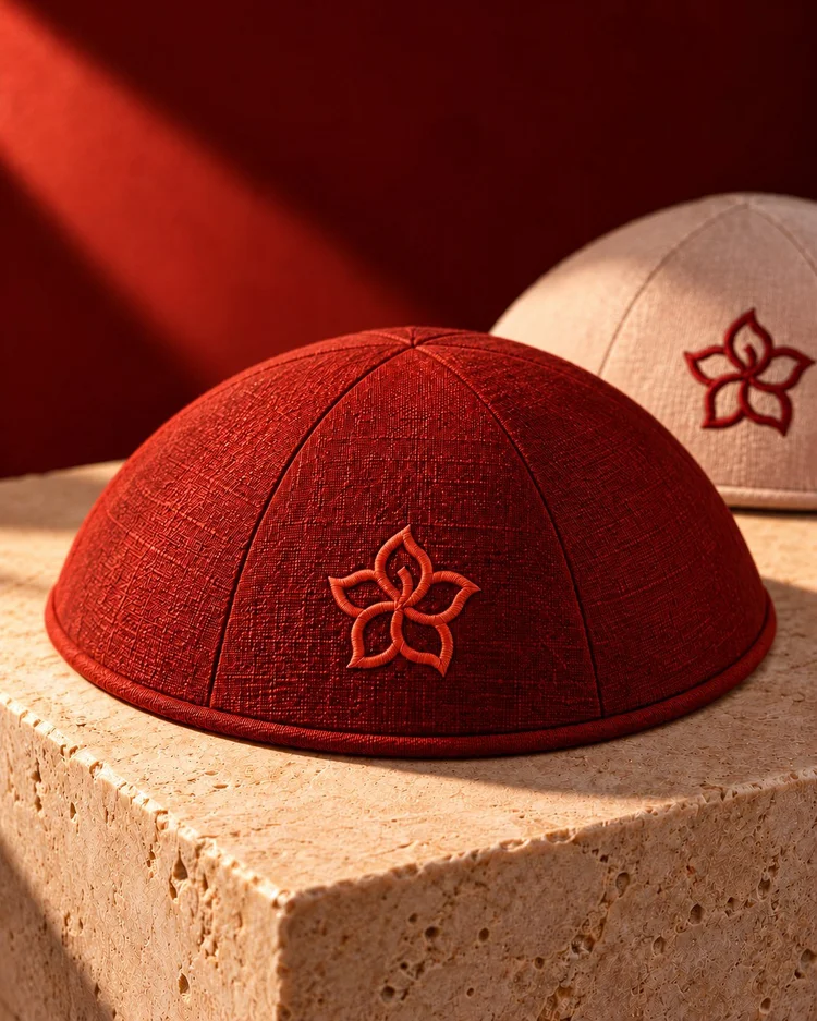
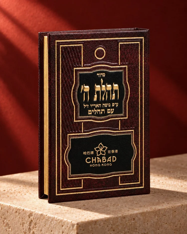
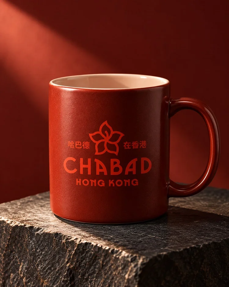
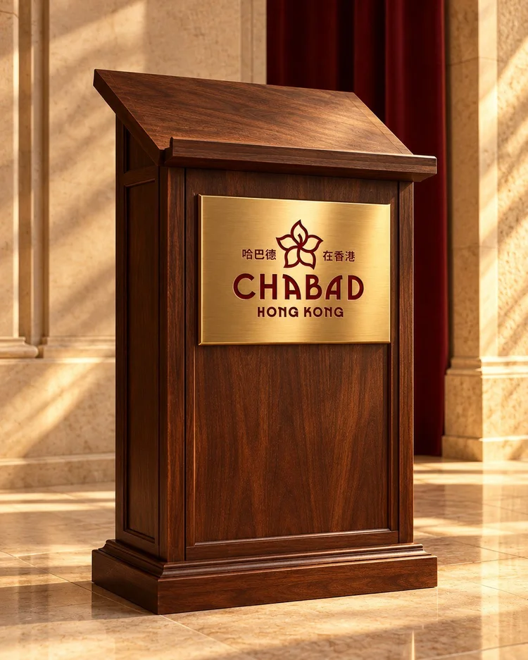
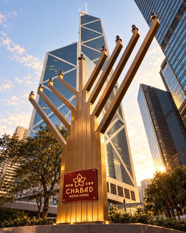
The Brand in Use
See how your brand comes alive

Behind the brand
Subliminal messaging communicated through your mark

Color
Unmistakably Hong Kong
Getting the red right was key. We chose a warm, rich shade that feels familiar, then layered lighter and deeper reds to keep it modern and playful. Slate blue extends the palette and gives the brand a quieter option for more understated uses.
Signature colors on blush
